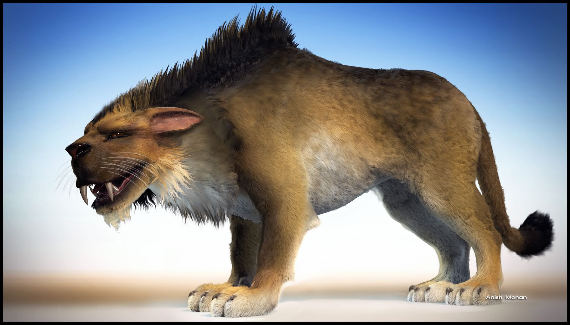
LIGERRONNE
-
anishmations
- Beta Tester
- Posts: 428
- Joined: Mon Oct 26, 2009 9:38 pm
- Full Name: Anish Mohan
- Company/Affiliation: FAT BALLOON ANIMATIONS
- Job Title/Position: 3d Art Lead
- Location: India
- Contact:
LIGERRONNE
Dear All,
Another character with Hairfarm...My 1st trial using HF for Fur...

Thanks
Another character with Hairfarm...My 1st trial using HF for Fur...

Thanks
-
pitiwazou
- Former Beta Tester
- Posts: 53
- Joined: Sun Oct 04, 2009 9:55 am
- Full Name: Cédric Lepiller
- Job Title/Position: freelance
- Location: France
- Contact:
Re: LIGERRONNE
Very good 
-
Switcher
- Former Beta Tester
- Posts: 221
- Joined: Mon Sep 21, 2009 11:19 am
- Full Name: Guillaume CERDAN
- Company/Affiliation: Ubisoft
- Job Title/Position: Environment Artist
- Location: France
Re: LIGERRONNE
Once again, good work !! It kicks ass !
-
Infinite
- Beta Tester
- Posts: 395
- Joined: Thu Apr 30, 2009 10:52 am
- Full Name: Lee Perry-Smith
- Contact:
Re: LIGERRONNE
WOW! It looks like a big budget CG Cartoon character! Awesome work!
-
Elendil
- Beta Tester
- Posts: 52
- Joined: Thu Oct 08, 2009 7:33 am
- Full Name: Nicolas Boyer
- Job Title/Position: Ingénieur
Re: LIGERRONNE
It's superb like it like your others creations ...
-
anishmations
- Beta Tester
- Posts: 428
- Joined: Mon Oct 26, 2009 9:38 pm
- Full Name: Anish Mohan
- Company/Affiliation: FAT BALLOON ANIMATIONS
- Job Title/Position: 3d Art Lead
- Location: India
- Contact:
Re: LIGERRONNE
Thank you all 
Just replaced the image with a better comp..
Just replaced the image with a better comp..
-
superrune
- Beta Tester
- Posts: 361
- Joined: Wed Jun 03, 2009 12:29 pm
- Full Name: Rune Spaans
- Location: Oslo, Norway
- Contact:
Re: LIGERRONNE
Fantastic character!
Two suggestions that would make the image better:
- Have more space in front of the character than behind.
- The contact shadows on the paws are a bit weird, are they photoshopped? Some proper 3D shadows would improve the image a lot
Two suggestions that would make the image better:
- Have more space in front of the character than behind.
- The contact shadows on the paws are a bit weird, are they photoshopped? Some proper 3D shadows would improve the image a lot
freelance animation, illustration, scripting, lego: http://www.superrune.com
-
anishmations
- Beta Tester
- Posts: 428
- Joined: Mon Oct 26, 2009 9:38 pm
- Full Name: Anish Mohan
- Company/Affiliation: FAT BALLOON ANIMATIONS
- Job Title/Position: 3d Art Lead
- Location: India
- Contact:
Re: LIGERRONNE
Yep..I had forgotten to keep a ground plane for contact shadows.. so I photoshopped it in final comp.. 
Very useful tips Superrune...Thanks!
The image has been updated.
Very useful tips Superrune...Thanks!
The image has been updated.
-
Infinite
- Beta Tester
- Posts: 395
- Joined: Thu Apr 30, 2009 10:52 am
- Full Name: Lee Perry-Smith
- Contact:
Re: LIGERRONNE
WOW! the close up shot on the updated version is just jaw dropping. Cem this really shows off what Hair-Farm can do. I hope bigger studios take note of this.
anishmations you did a brilliant Job controlling the styling modifiers and hair modelling. Really amazing job
anishmations you did a brilliant Job controlling the styling modifiers and hair modelling. Really amazing job
-
anishmations
- Beta Tester
- Posts: 428
- Joined: Mon Oct 26, 2009 9:38 pm
- Full Name: Anish Mohan
- Company/Affiliation: FAT BALLOON ANIMATIONS
- Job Title/Position: 3d Art Lead
- Location: India
- Contact:
Re: LIGERRONNE
thanks infinite..
Indeed Hairfarm is SO DAMN GOOD! too good to be true tat am considering quitting modeling n becomin full time hairfarmer.
Indeed Hairfarm is SO DAMN GOOD! too good to be true tat am considering quitting modeling n becomin full time hairfarmer.


